Slow craft. Sharp business.
I built a coffee brand around a single word: house. Then the door closed to the public, and the brand got sharper.
The context.
Four people, one house in Ericeira, fifteen years of coffee behind the counter.
There was a name and a mood. There was no voice, no system, no shape. The weekend café filled the room and emptied the team, while the thing actually worth selling, what these people know, had no form and no language.
The work was to give it both.
The sharpest move the brand made was subtractive.
No more walk-ins on weekends. Exclusivity became the sales argument instead of the limitation, and everything downstream, the offer, the pricing, the tone, finally had a spine.
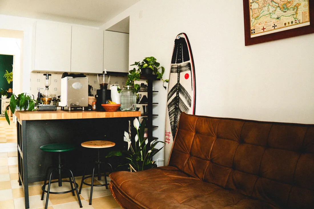
The house works by appointment. The exclusivity of the space is a sales argument, not a limitation.
The voice.
Grab our fantastic boutique consultancy now and discover how we can transform your business with innovative solutions!
We don't sell coffee. We sell decisions with flavour.
- No em dashes. Comma or full stop. Thirty-six taken out of one site to make it stick.
- Numbers never sit in the display typeface. They live in the mono.
- Prices carry equal weight between options. The first draft made the low price small, in brackets. Rejected. The accessible price now shares the exact type size, split only by a thin rule. An accessible price should never look like second place.
you'll try latte art, experimentally, without going deep.
Approvedfirst notions of latte art.
The boundary: communicate limits in the positive, never through a disclaimer.
The identity.
Three typefaces, one division of labour. A drawn serif for the headlines carries the craft. A mono carries the numbers, the labels, the prices. When a price in mono sits beside a title in serif, the brand says its own sentence without writing a word.
- Mystic Grace · headlines, the gesture, the hand
- Arapey · body, the editorial tone, the long read
- DM Mono · numbers, data, labels, the sharp-business side
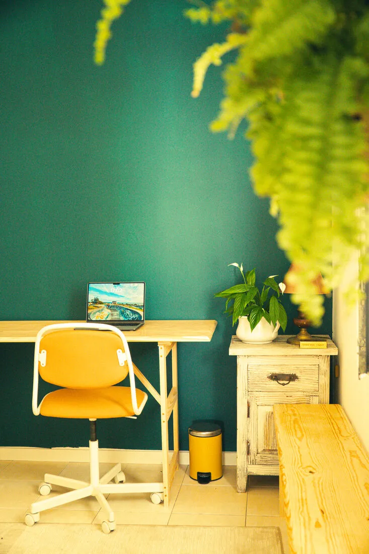
The colour is forest green, #0c3a26. Not coffee brown. The door of the house is green, a detail of identity that also does the logistics work in the emails. The symbol is a seagull, drawn into the logo. Atlantic coast without the wave cliché.
Two languages, one voice.
Not a translated site. A brand written twice from the first line. Portuguese in the morning session, English in the afternoon, same programme, same house. Portuguese first, English second, unless the audience is international, in which case it flips. That's a decision, not a default.
The house, running.
- WorkshopsFor the curious, for those who already know, and for those who want to sharpen.
- DiagnosticsYour coffee can do more.
- EventsWe bring the house to you.
- Cave ClubA club. A house. A ritual.
- Site and landings in production, bilingual, with measurement and payment connected.
- A capture app with language detection, published on the edge.
- Payment in production with an automatic receipt.
- Lifecycle automation in its own worker: it takes the purchase, stores the booking, reads the class date written in plain Portuguese or English, works out the customer's language and what they bought, and sends the right email on the right day across the following two weeks.
- Server-side measurement with event deduplication and first-click attribution to the payment.
- Documentation and playbooks handed to the team, who run it without the studio in the room.
The infrastructure is built and running. The results are too early to tell, and I don't tell results before their time.
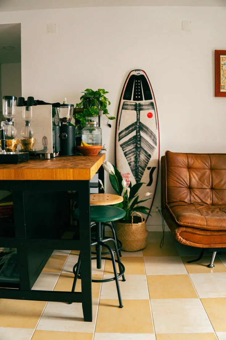
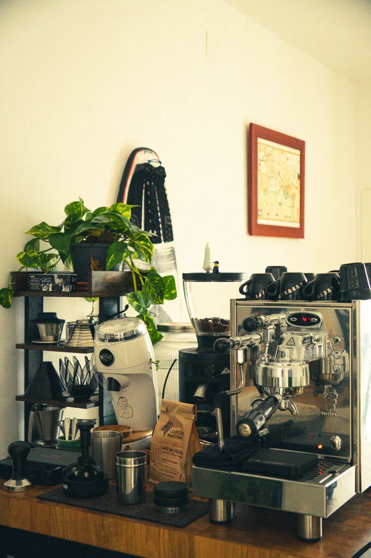
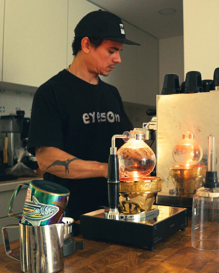
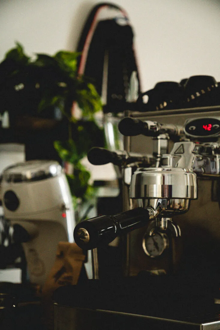
The house works by appointment. The door is green. The classes stop at five. The emails come from a person, not a brand. I'm still there.
This is what Culture looks like · brand, content and growth, one partner, one or two brands at a time.
VideoContent in motion.
The site
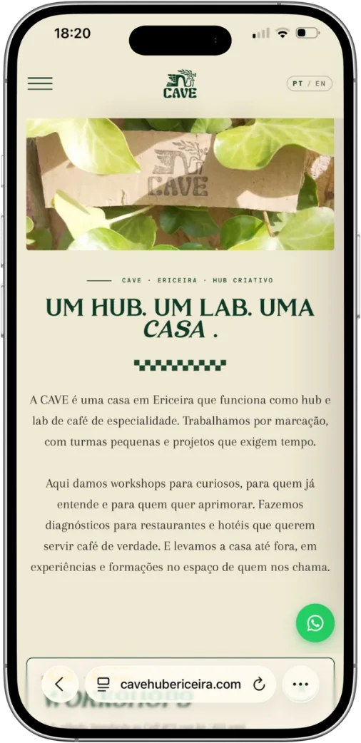
The house, on a phone.
The landing that carries the concept and the voice of the house.
Visit the site →